

Overview:
In addition to my normal product design duties at Spectrum Enterprise, I worked on a small team of specialists to create, define and document our enterprise design system, Mountaineer. I took the lead on designing a new pattern for multi-row table actions.
Tools:
Axure, Figma, Dropbox Paper, Chalk
Duration:
12 Weeks
Team:
Elisa Krebs, UX Designer
Jessica Simon, Team Lead
Brian Azcuenaga, UX Research
Tara McDaniels, UI Designer
Jason Wagner, Design Systems Manager
Hemanth Bodipati, Accessibility Architect
My Role:
Table audit
Pattern exploration
Usability test design
Testing analysis
Prototyping
Final documentation
The Problem
In early 2021, multiple product teams identified a need for table in which actions could be taken on multiple rows at once.
Typically in a situation like this, we would borrow a component from Kite, our B2C design system.
In this case, a multi-select table didn’t exist in the B2C system either. We needed a net new component.
As an enterprise customer or internal Spectrum Enterprise employee…
I need a way to take action on multiple rows of table data at one time in order to complete my job duties more efficiently.

Discovery: Start With What You Do Know
Table Audit
My first step was to review and document every table on the SpectrumEnterprise.net portal.
I did this to understand the various use cases, constraints and unusual actions we might need to account for.
I documented these tables, taking screenshots and noting:
Cell types
Table types
Action types
Interactions and hover states
Bugs & issues with proper styling or odd interactions
Audit Results & Design Considerations:
1. Our client facing portal has no less than 23 tables and 9 cell types.*
* This audit does not include any internal applications used by Spectrum Enterprise employees, which are also table-heavy.
2. Currently, single row actions are completed in a More Menu at the the end of each row.*
* Needed to maintain awareness of this as we looked at introducing a new style, in an attempt to not completely betray our users’ mental model.

Discovery: Get Inspired From Others
Enterprise Table Best Practices
It turns out enterprise tables are not one-size-fits-all.
The following 3 articles were extremely helpful in understanding the complexities and variations between table types.

* In Axure Cloud, More Menus on the individual rows stayed persistent when checkboxes were selected. If you chose an action from the menu, it would only apply to that row — not the others that were also selected.
Pattern Discovery & Collection
I am always more inspired after looking at examples of how others have tackled similar situations.
My team and I started looking for tables in products we use everyday and compared how they handled multi-row interactions.
We analyzed the interaction patterns of:
Gmail
Google Drive
Dropbox
Axure Cloud
ADP Workforce Now
Pattern Insights & Takeaways
1. Most tables use some sort of toolbar above or below the table to display multi-row actions after selecting of a checkbox. All other interactions vary heavily from product to product.
2. Team consensus: hide the more menu at the end of the rows once a checkbox is selected.*
* Since we currently use a more menu for single row actions, we paid special attention to how certain products handled similar interactions.
The Axure Cloud experience did not match any of our team members expectations, and therefore we noted that we wanted to avoid this interaction altogether.
User Research: From Assumptions to Design
Choosing a Table to Test
I don’t love to make assumptions in my work, but in order to move forward, I chose to test a table pattern that seamed to align closely with our current table and matched the most common use of a toolbar appearing above the table.
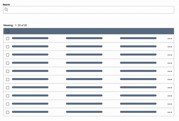
In this table pattern:
Single-row actions are taken on the More Menu. Actions that can only be applied to one row at a time (i.e. edit) are only available in the more menu.
Multi-row actions are taken from the action toolbar above the table.
The More Menu at the end of each row disappears upon selection of a checkbox.
We assumed…
Our users are used to taking single-row actions from the More Menu, so they will continue to follow that pattern.
A checkbox on each row is a strong enough affordance that actions can be taken on multiple rows, even if the action icons or buttons don’t appear above the table until after a checkbox is selected.
User Research: Designing the Test
I created a fully interactive prototype in Axure based on 2 realistic scenarios for our portal users.
For each scenario, I intentionally alternated between single row actions and multi-row actions so we could pick up on how users expected to handle each of these types of actions.

Scenario: You are the administrator for your company’s telecommunications services and need to make some changes to a few users.
Task 1: Sofie Hernandez, Ciara Mayer and Summer-Rose Cash no longer work at the company. Delete these users.
Task 2: Sia Rosella’s email is incorrect. It should be Sia.rosella@gmail.com. Please update it. Once it’s updated, send Sia a registration email.
Task 3: A request from the client just came in: Ariel Roach, Jaden Keith and Marlie K. Berhard also need their registration emails re-sent.
You know what they say about assumptions…
Before I took my test to UXR, I ran it by Tara, our UI Designer, to double check for correct styling in the prototype.
Tara completed the test and messaged me that she got tripped up on the single-row action.
After completing a task on multiple rows using checkboxes, her natural tendency was to select the checkbox for her next single-row action.
In the solution we designed, the actions that could only be taken on a single row (i.e. edit) were only in the More Menu.

So why did we design it this way to begin with?
Our tables currently use a More Menu for single-row actions. We wanted this to remain consistent.
We assumed that users would automatically take all single-row actions from the More Menu.
We assumed in our early discovery that implementing a dynamic toolbar was going to get push back from development.
With a dynamic toolbar, if only one checkbox is selected, actions that can only be taken on a single row at one time (i.e. edit) would appear, but then disappear once a second checkbox is selected
After Tara’s run-through, I decided to prototype and test a second pattern where the action bar changes dynamically depending on if 1 or >1 are selected (seen on the right).
Research: From Usability Test to A/B Test
I worked with my UX Research colleague to build out an A/B test. Testing 2 solutions against each other would ultimately help us gather leverage to win-over our stakeholders.*
* We don’t currently have a developer on our design system team.
In order for this initiative to be successful, we needed to convince an omni team to take on additional work to develop a reusable table component.
Test Details:
Unmoderated sessions on Usertesting.com
30 total participants (15 for each version)
Users were employees responsible for administrative actions within their company
2 scenarios per user test, 3 tasks per scenario
Usability Test Results and Insights
Version A (Static Toolbar):

Version B (Dynamic Toolbar):

1. Users expected to be able to take actions on a single row from both the action toolbar as well as the more menu — there was no general consensus. UX Research recommended moving forward with Version B, the dynamic toolbar.
2. Recommend a conversation between UX, UI and Accessibility to decide if the icon buttons should be accompanied by a label.*
* One participant did not understand what the email icon meant. Three participants commented that the tooltip on hover of the icon helped them to understand the button and feel more confident taking the email action.

We have a table!
After testing, it was clear to the team that utilizing a dynamic toolbar would be the best path moving forward.
This was a small win, however, there was still a large amount of work to be done.
Design to Development Approach
Because we have so many variations of tables throughout the portal and product teams are not currently utilizing reusable components, we needed a strategic approach that could deliver a consistent style and experience.
Jason Wagner, Design Operations Manager, introduced the idea of knobs to the team. If built and implemented correctly, knobs (used in Storybook) will allow developers to turn on/off the table features that apply to each product instance.
To support this initiative, I got to work outlining, documenting and prototyping examples of every possible table variant we could have.

Documentation: Variants
Default:
The default data table comes with a base style with only the title, header, and table elements.
With Inline Action:
Tables with inline actions have an overflow menu at the end of each row that contains actions related specifically to that row. A batch action toolbar appears above the table when a singtable rows are selected.
With Batch Action:
Tables with batch actions allows the user to select multiple rows and apply an action. A batch action toolbar appears above the table when table rows are selected.
With Horizontal Scroll:
A horizontal scroll is used on tables with too many columns to fit into a traditional table width. The table scrolls to the left and right on the page to reveal more columns. If necessary, sticky columns can be used to make sure that inline action menus and/or batch action checkboxes are always visible and able to be actioned on.
With Expandable Row:
The expandable data table is useful for presenting large amounts of data in a small space. Rows are collapsed and can be expanded to reveal extra information. Use the expanded section for supplementary information or data that needs additional query time.
To make discussing and defining each variant easier, I prototyped all possible combinations.
Feel free to click around on these, all of them are at least partially interactive!
Documentation: How are table actions are performed?
We went back to our audit and noticed that our tables also lacked consistency in where and how table actions were performed.
I worked with Jessica, our team lead, to define how other components should be used to perform various actions.
Full-Page Dialogue

Full-page dialogues should be used for page-level actions or adding a row to a data table (i.e. creating a user).
Modal

Modals should only be used to confirm an immediate action or decision (i.e. “Are you sure you want to delete the selected files?”).
Slide-Out Panel

Panels should be used for more complex actions on row(s) that require additional information from the user to complete the task (i.e. edit, move).
What’s next for the “mega table”?
The table is not yet complete — but we’re close! Currently we are working on:
UI Hardening (UI Team)
Defining the sticky row styling & interaction
Hardening spacing rules for the toolbar
Discussing if icons or buttons should be used in the toolbar
Defining cell-type styling
Storybook POC (Design Ops)
Creating a test-run of the mega component in Storybook as an example for when we present to stakeholders